Tuesday, December 13, 2011

Santa Vase

OK, Froggers. This is just a simple little post since I am having a party for 40+ people next week. Never mind that I've hardly done any Christmas shopping, only have half of my decorating done, the lights on the elaborate crystal and silver stairway garland won't light, and my house is a MESS. So, this is short and sweet.
I can't even take take credit for the design of this delightful decoration, but I saw it on Pinterest, and HAD to do it. I just took a "small belt that I'll never be able to wear again" out of my belt collection under my bed that has gathered dust, cut it down, made a hole with my lovely Cropodile tool (which quite frankly, looks like an obstetrical instrument), and belted it around a vase that was filled with cranberries and water. I also put a large tealight in the top so that I can light it and draw attention to it. After all, I want Crafty Credits with my friends, Peeps. Isn't that what it's all about?
Have a great, productive day, unlike me.
Fondly, Tami


Monday, November 28, 2011

Subway Art Bureau

Hey, Froggers. Now that Thanksgiving is over, I can concentrate on what I REALLY love to do, which is painting and designing. I was inspired by some furniture I had seen on some other blogs, and I had the perfect bureau to try it on. I used the same techniques on my other pieces here and here. I'm super excited about how this turned out. It will be for sale as soon as I can transport it to my space at Building Character in Lancaster, PA.  I'm the Howsewears booth (look for the Howsewears banner). If you're interested in purchasing it and are fairly local to Lancaster County, let me know. I can't wait to find a loving home for it.
Unfortunately, I forgot to take a before picture, so use your imagination. It was just a plain old brown bureau with some scratches.


This piece is near and dear to my heart since I spent so much time in Lancaster. Some of the landmarks don't exist as businesses anymore, which gives it a more vintage feel.


I LOVE wooden knobs. I can do so many things with them. These are painted with Paris Gray mixed with a little bit of Graphite (as is the top). They're distressed and waxed with Briwax Antique Oak.


The body was painted with Graphite, with Old White lettering. It was waxed with Clear and then Antique Oak Briwax, followed by buffing for a nice patina.


I love the detail in the upper drawer, and accented it with Old White.


It almost seems at home here next to a field in Lancaster County.
It's a delightful size:
Height- 3'4"
Width- 2' 5"
Depth- 3' 5"
And, as always, let me know what you think. I love hearing from you!!!
Fondly, Tami

I'm linking to:

Skip to My Lou
Embellishing Life
Sisters of the Wild West
Today's Creative Blog
Tip Junkie 
Vintage Wannabee 
Not Just a Housewife 
Hope Studios
A Stroll Through Life
Topsy Turvy 
Domestically Speaking 
Trendy Treehouse 
The Thrifty Home 
Fameworthy Shot
Savvy Southern Style
Blue Cricket Design 
Handy Man, Crafty Woman 
Polka Dots on Parade 
No Minimalist Here 
A Diamond in the Stuff 
House of Hepworths 
The Shabby Creek Cottage 
Brandyscrafts 
Centsational Girl 
Miss Mustard Seed 
The Shabby Nest
My Romantic Home
Tatertots and Jello 
My Repurposed Life 
Fingerprints on the Fridge 
French Country Cottage 
Funky Junk Interiors 
Sisters of the Wild West 
Under the Table and Dreaming 
Homemaker on a Dime
I Heart Naptime
Between Naps on the Porch
Meg and Mum's
Sumo's Sweet Stuff
The DIY Showoff
Craftomaniac
Embellishing Life
Delightful Order 
brandyscrafts
sweetpeasandbumblebees
The 36th Avenue
Somewhat Simple
Primitive and Proper 
At Home With K 
HomeSavvyAtoZ 
Chic on a Shoestring 
Creating Really Awesome Free Things
Crafts Keep Me Sane
boogieboardcottage
The Girl Creative 
The GunnySack 
Homemaker on a Dime 
Polly Want a Crafter 
The Southern Institute 
Knick of Time Tuesday 
Singing Three Little Birds
Beyond the Picket Fence 
I Am Only 1 Woman 
Flamingo Toes 
Ginger Snap Crafts 
It's Overflowing 
One Woman's Haven 
DIY by Design 
Designer Garden 
Finding Fabulous for Less 
Be Different, Act Normal 
Suzy's Artsy Craftsy Sitcom 
My 1929 Charmer Blog
Embracing Change 
The Vintage Farmhouse

Friday, November 4, 2011

Stools, Stools, and More Stools


Hey again, Froggers! It's STOOL day (which just sounds wrong). I've had these stools for a few months and finally got around to reverse stenciling them. I'm stoked at how they turned out!


And, remember this piece from the last post? Yes, it is Chalk Paint, but there's a twist.


I am a red fanatic. I LOVE red. I have a red checked couch in my living room. And a red leather chair and ottoman. And I LOVE chalk paint. However, the Emperor's Red color is just a little too SCREAMO RED for me. So, I decided to tone it down.
I played around with the mixture and came up with the perfect ratio. This red is a ratio of 1of Graphite to 8 of Emperor's Red. I like making small amounts for my frames, so I use 1 tablespoon of Graphite to 8 tablespoons of Emperor's Red. In a future post, I'll show you some different colors using Versailles, simply because I accidentally bought 2 quarts instead of one. That'll teach me to check my shopping cart before I check out!
Thanks for reading. And, as always, please feel free to leave comments!
Fondly, Tami
I'm linking to:
Miss Mustard Seed
Kammie's Korner
Home Savvy AtoZ 
Primitive and Proper 
Coastal Charm
My Uncommon Slice of Suburbia 
A Diamond in the Stuff 
Days of Chalk and Chocolate 
Sisters of the Wild West 
my1929charmerblog
The 36th Avenue
No Minimalist Here
DIY by Design
Gingersnap Crafts
Beyond the Picket Fence
Saavy Southern Style 
The Southern Institute 
The Trendy Treehouse 
Tatertots and Jello 
House of Hepworths

Wednesday, November 2, 2011

Subway Art- Part 2

I finished my subway art. If you remember the previous post, I didn't have the swirlies on it. I just thought I should add them for some more visual interest. You see that the letters are red, because after I applied the green vinyl onto the red painted board, I painted over the whole thing, vinyl and all, with Old White chalk paint. I carefully pulled up the vinyl, to reveal the red letters. I really love that effect, and it makes it look hand painted. I waxed it with clear Briwax and buffed to a lovely subtle luster. A sawtooth hanger completed the ensemble, and it's ready to be donated to a charitable cause.


I've had some fun doing these other projects as well:


You can't quite tell in this pic, but the base coat is red but the top is Versailles chalk paint with a dry brush technique.


Can you tell I'm into swirlies lately? You may wonder which color the red paint is. I'll give you a hint. It's chalk paint, but I'll reveal my secret later.


This is a simple wood panel with some scrapbook paper decopaged on top. However, the JOY letters were cut with my Cricut, Sure Cuts a Lot, and cereal box material. Since the cereal box isn't super sturdy, I double each letter up, using Mod Podge as a glue. It's such an economical way to do things! And then, I covered them with silver glass glitter from Meyer-Imports. I LOVE their glass glitter! The pic doesn't do it justice. The letters really sparkle.


These letters were "official" chipboard, bought at the Cozy Crop House, which is also now a Ranger retailer. Woot, woot! Right down the street from me! It doesn't get better than that, Froggers!


A mini sign, done on a wood panel.


This Noel was also cut out of cereal box material. I'm gonna have to go eat more Wheat Chex!
Well, that's it for now. I hope you enjoyed seeing a few of my projects, and that this gave you some inspiration! After all, that's how I roll.
And, PLEASE leave some comments if you enjoyed this!
Fondly, Tami
I'm linking to:


Sunday, October 30, 2011

Subway Art How-To

Hey, Froggers. I've been so busy crafting I almost can't stand myself! Well, at least I think HubbyDoc can't stand me.
I've been doing subway art for about 6 months now, and I've come up with a few techniques that I think might just help all of you who have struggled with spacing, cursed at transfer tape, and just generally stayed away from it for fear that it just wouldn't look good.
Well, fear not. I believe I have some solutions.
Now, I do apologize if I'm stepping on anyone's foot by taking credit for these "techniques". I truly have never seen anything like this on any blogs, so if there is, please let me know.
First, you make your design on your design program (Sure Cuts a Lot, Make the Cut, or any other programs out there). Once you have oodged and finagled and scrunched everything into place on your virtual mat, group all of your images to make them one, and center your image on your virtual mat- both horizontally and vertically. This is extremely important.

If your design has many components, which is kinda what subway art is all about, to take the "negative pieces" (the pieces that are going to be thrown out), it's easier to compartmentalize them. This means, take an exacto knife and cut around the words or symbols in sections. That way, you don't have to pull the discarded piece off all at once, which is very hard to do.


Here's another pic with some of the negative vinyl already taken off. You can see the sections cut away. When you're using your exacto knife, be careful not to cut through the white backing.


After you've taken off all of your unusable vinyl and the innerds of the letters (like the inside of the A and E, etc.), you're ready to place your transfet tape on top. I usually measure mine out using the grids on the back. I try to make a piece the same size as the vinyl design so as not to waste anything (I'm terribly cheap frugal. I'm so cheap frugal, that I sometimes use clear contact paper instead of transfer paper. Today, I didn't have a piece of transfer paper big enough, so I used the contact paper. I'm finding that I actually like that better anyway.


Once I place the contact paper on top, I trim all of the edges. Then I burnish all of the design to encourage it to stick to the transfer paper once I lift the design off.


Now, here's where I forgot to take a picture. Ugh. Just use your imagination.
Pretend I've drawn a grid on the 12 inch mark and the 6 inch mark since I used a 12x24 inch mat (remember that everything is centered horizontally and vertically?). So, there's a crosshair mark on the transfer tape. This is done before I take the vinyl (still on its backing) with the transfer tape off of the mat. This is KEY, folks!


Now, make a grid on your board (or whatever you're putting your subway art onto), making vertical and horizontal lines to mark the exact center.


Now, to backtrack just a little, you will have already painted your board whatever color you want your letters or designs to be. I wanted mine to be red, so my board was already painted before I marked the center.

Now, you're going to remove your designs, with the transfer paper and vinyl backing, from your mat.


Here, you can see the exact center that I drew, using the lines on the mat before I took everything off. Now, cut your design in sections with scissors. Here's another tip- don't cut your sections in a straight line. Make the lines squiggly, with notches in them. You'll see later why it's helpful.
I cut mine in small enough sections that it's easy to peel off the transfer tape with letters. If you make your sections too big, it gets too unruly.
Here's another important tip. When you cut your sections, just make sure that one of the sections has the cross from the crosshairs. This way, you can line it up on your vertical line as well as your horizontal line.
Here are the sections. You can see that the only straight lines are the edges.


Once the sections are all cut, take the section with the center lines, and peel off the letters using the transfer tape. I often have to use a spatula to coax the letters off. This can be tedious, and I haven't found a better way, so if anyone knows of one, please LMK!!!


Line up your center piece on the center grids and burnish. I usually just use my fingers and go over the letters. If you put the center piece on first, everything else will line up perfectly.


Since you've made your edges uneven, it's now easy to line up the rest of your pieces. I often have to refer to my design on my computer, but that's my problem.


Here, I added the Christmas word, which was easy since I have the grid marks to line up. Finish placing all of your sections on the board, lining them up with the previous section.
Now, pull your transfer tape off. I like to make sure my letters are burnished a little more and then I pull off the tape at a hard angle. This keeps the letters from pulling up off of the board.


And here's the final design before the next coat of paint, which I'll show you the next time.


I hope this is useful, and as always, feel free to leave comments!
Fondly, Tami
I'm linking to the following:
Embellishing Life with Handmade Goodness
Sumo's Sweet Stuff
DIY Showoff  Parade
Fingerprints on the Fridge
Finding Faboulos for Less
Remodelaholic
The Shabby Nest
Sisters of the Wild West 
French Country Cottage 
The 36th Avenue 
My 1929  Charmer Blog
The Southern Institute 
The Trendy Treehouse 
I Heart Naptime
Beyond the Picket Fence
No Minimalist Here 
House of Hepworths 
Under the Table and Dreaming

Friday, October 21, 2011

Mrs. Goodwill

Don't you all just LOVE Mrs. Goodwill. She's SO generous and loving. She lets me practially STEAL furniture from her. Good stuff. She's one of my besties!

Here's something she gave me while I was dropping youngest off at college. I was apoplectic to find a Goodwill in the very town where we are paying college tuition. The SECOND college tuition.
A few years ago, my dentist told me that after we started paying college payments, a new car payment would look like nothing. He was right.
So, here's the winner from Mrs. G. I call him "Stumpy."

He didn't have any ailments, except for some dry skin, resulting in a few cracks, but I soothed his aching, cracked dermititis with some filler. Then I sanded to reveal the wood, as smooth as a baby's derrier.


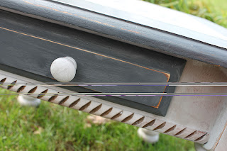
Blogspot is not cooperating with my photo uploads, so there's a nice break. Isn't that professional looking? Ugh. Anyway, I liked Stumpy's drawer. The hash marks make him look like he's been in a fight, but I think those are just symbols of the ladies who admired him in the store.


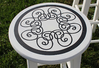
Here's the top. I used the reverse stencil technique, of which I am so fond. He needed a design, and I hope I didn't give him a gender identity crisis by putting on a few swirls.


Again, Froggers, the horizontal lines are not really part of the design.
The paint is Paris Grey and Graphite chalk paint. I distressed this guy a little, and applied clear Briwax. Don't tell him I said so, but I think he's pretty.
Thanks again for looking!
Fondly, Tami
Linking to:
Craftomaniac
Skip to my Lou
Sumo's Sweet Stuff
Between Naps on the Porch
Savvy Southern Style
Beyond the Picket Fence 
Knick of Time Interiors 
Miss Mustard Seed
Sisters of the Wild West
Primitive and Proper

Tuesday, October 18, 2011

Crafting away

Boy, am I ever pooped! I've needed to craft away for my space at Building Character. It's nice to HAVE to craft, though. It takes away any guilt that I might feel for having lots of dust on my tables, dirt on my floor, and general scuzzies in the house.
Since I'm so tired, I need to keep this brief. I thought I'd show you a few things I've been working on. But, you have to forgive me for 2 things:
1. I didn't take before pics. I totally forgot. Sorry.
2. These pics were taken with my cell phone because I was so busy crafting, I forgot to take pics before I put them in my Howsewears space. Sorry again.

Here are some tags. I finally bought a pasta machine to roll them out. Boy, am I ever glad I did!


Here's a lamp (there are actually 2) that I bought at a yard sale and dressed up the shade with...you guessed it...drop cloth material. I added a few rosettes to make it cute. Gotta make it cute.


 On the right side, you can see the hand towel box that covers those Kleenex hand towels. I thought that having the plain Kleenex box in the bathroom was rather boring and not very classy. I asked my dad if he could make a wooden cover for it, and lo and behold. He's pretty fab.
Of course, I had to paint it and put a graphic on it. Yeah.


And here's another wreath.


The picture doesn't do it justice. It's made with dried sunflowers, dogwood blossoms, straw flowers, blackberry lilies, yarrow, red peppers, lavender, status, hydrangeas, globe thistle, and dried daffodils. The flowers were all grown by HubbyDoc and then I dry them. I love that symbiotic relationship.
Well, I think I need to take a shower and curl up with my sudoku or a book.
Thanks again for reading! And, don't forget to "like" my Facebook Howsewears page (more coming up on that as I transition to my new computer)
Fondly, Tami
I'm linking to:
todayscreativeblog
tipjunkie
Hope Studios  
Vintage Wannabe
Coastal Charm
Finding Fabulous for Less
Fingerprints on the Fridge
Remodelaholic

Friday, September 30, 2011

Building Character

Yes, Froggers. I have taken the plunge. I now rent some space in a funky warehouse in Lancaster, PA, called Building Character. It's a great place with unique items, and was recently voted the second best place to buy antiques in Lancaster. Pretty cool.
I'm very excited to start this new adventure. The name of my business is Howsewears and the tag line is "Wearable Art for your Home". I'm specializing in painted furniture with a twist, and custom signs (including subway art). I've slightly nervous, but if I wasn't, that would be a warning sign.
I also have a Facebook page, obviously called Howsewears. I've been so busy with my inventory that I haven't had time to work on my web site (howsewears.com), or the Facebook page, but they'll both be up and running, hopefully by the end of the month. So, feel free to "like" my Howsewears page.
Building Character also participates in the First Friday events in downtown Lancaster, with live music, etc. So if you're in the area, I'd love to see you! Stop in and say, "Hi". 
Here are a couple of pics to give you an idea what my space looks like. I need to do some painting, etc. but it will come along. It looks somewhat sparse because the photographer, who is doing some advertising, has some items at another location.


It's amazing what you can do with chalk paint. These gourds turned out so cute! I wanted to keep them, but alas, I can't keep everything I do.


Here they are with the bureau I did. I like the combo.


And here is my tiny space. I'll get there. I'm pretty stoked, though. I have a zillion and one ideas for things to make, ways to decorate the space. Can you say, "drop cloth curtains???" But, this will do for now.


So, there you have it. I'll let you know how things go.
Fondly, Tami

Thursday, September 29, 2011

Oak Chest

Hey, Froggers. I've been busy getting more stuff ready for my NEW SPACE!!! Yup, I've taken the plunge. I've taken over some space in Lancaster, PA called Building Character. I am uber excited about it. My new business is called Howsewears- Wearable Art for your Home. I'll have pics of my space in a future post. Here's the newest item that will be placed in this funky warehouse:

She started out like this:


All in all, she wasn't bad looking.


She was a little roughed up.


She was missing the top key medallion, but never fear. I had a plan.


She needed some filling and sanding.


I started using some graphite chalk paint, having some idea of what I wanted, but I wasn't quite sure.


After much contemplation, a few sketches, several prayers, and some raw nerve, I started painting, using a dry brush technique and some old white chalk paint.


This was a lot of fun to do.


The key medallion was refashioned. I was going to just leave them off, but they added some character.


When I chipped off the existing 2 medallions, one of them was intact, so I used some mold n pour to make a mold, then I made 2 more out of Fimo clay. You can bake the clay in these molds, so that was incredibly useful. To unmold the clay would have distorted it too much.


Since the top didn't look too bad, I sanded her down, added several coats of mahogany Briwax, and buffed to a lovely luster. The top turned out so gorgeous, if I do say so myself.


The flaming is so lucious.


And here she is in her full glory. I'm kinda likin' her. But alas, she must take a trip to Building Character to find a new home. Do you like her?


Fondly, Tami
BTW, I'm linking to:
2805